Every so often, I'll stop for a second and be hit with the realisation that I haven't drawn anything in ages. It can be surprising how little physical drawing time can go in to running an illustration business sometimes!
Yesterday was one of those days, and I fancied a little bit of a warm up before delving in to some serious work. You may have seen The Big Draw floating around on social media or the news recently - they're, very basically, a huge campaign to get people drawing. This week they've joined forces with The Royal Shakespeare Company to theme drawings on fairies and A Midsummer Night's Dream.
I illustrated this little Autumnal fairy quickly, in ink, then sort of fell in love with her and decided to add in full colour in Photoshop. I'll admit that I rarely draw fairies. I'd been told too many times that I had to draw fairies in anything for little girls that it irked me - come on, we all know little girls can like space, treasure-hunting, dinosaurs AND fairies. I'm not one for telling anyone what they should or shouldn't like.
If you've kept up with my Pinterest boards lately, you'll see that I've been pinning a fair few golden beetles, so if you look carefully you'll see a couple of them make a little appearance in this Autumn-inspired dress, along with a few delicate cobwebs. Anyone else want a life-size version of that outfit? I know I do.
You can see this illustration featured on The RSC's facebook page and on my Twitter here!
Tuesday, 27 October 2015
Monday, 19 October 2015
Exciting Small Business 100 Feature!
Very pleased to announce that today is my Small Business 100 feature date!
You can see all the businesses involved and find out more about the day over on the official website. It's all about getting together to support small businesses and celebrate our drive to do what we love for a living.
Today's #SmallBiz100 is @emmelinedraws from Chorley http://t.co/mc7gIj3J4W pic.twitter.com/rudlP3yDUU
— SmallBizSatUK (@SmallBizSatUK) October 19, 2015
I really recommend finding some way to get involved this December. For last year's Small Business Saturday I hosted a picture book reading and children's art workshop at Ebb & Flo bookshop in Chorley - sometimes you really just have to break away from the desk and connect with other people! It's incredibly rewarding.
"I love writing honestly about my experiences to help #smallbiz - that sort of advice is invaluable" @emmelinedraws pic.twitter.com/gcXTCqslFp
— SmallBizSatUK (@SmallBizSatUK) October 19, 2015
You can keep up to date on all the Small Business Saturday social media hum over on Twitter and Facebook. You might well spy little snippets about my work floating around today, so keep an eye out for those, and I'll hopefully be making an appearance with some very interesting people on the Small Biz UK bus tour in Manchester this November! Hurray small businesses!
Thursday, 8 October 2015
An Illustrator in Italy - travel, sketching and snapshots from Lake Garda
When I’m travelling, you’ll almost always find a good
portion of my suitcase brimming with sketchbooks and pencils. There’s something
so personal about documenting your experiences through a sketch. I find it
really builds a memory and captures the atmosphere as you study each detail and
transfer it to paper. Reportage and
travel sketching has become an integral part of each trip I take, and looking
back over my sketchbooks immerses me in the memory often far more than a quick
snapshot can.
Well, after this near disaster at a festival recently (and
only taking hand luggage) I opted to leave the ink pot at home and stuck to
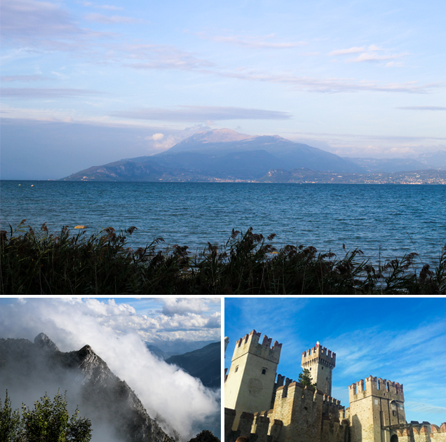
pencils, brush pens and a watercolour set as I took a week in Italy last month.
I’d never visited Italy before (despite dreams of going to Bologna book fair
each year). This trip was purely for family-time (and a much-needed break from
work!) so we headed to Limone on Lake Garda for lake-swims, mountain climbs and
castle adventures.
There aren’t many views I love more than mountains and vast
stretches of water. I love the variety of weather, the way the light plays on
the peaks and the array of colours as the day cycles. The lakeside beaches were
calm enough that I could sit for a few hours to read, paint and brave a swim.
Limone is famous for its gorgeous lemon groves, and it’s one
of those places where the tourist shops grab a theme and run with it (doesn’t
everywhere?). There were bundles of lemon themed gifts, the best lemonade I’ve
ever tasted and the town centre had wafts of sweet citrus as you walked along the cobbled streets.
Luckily, I love lemon! I really enjoyed learning about the heritage and history
of the town at a few of the restored lemon groves/museums where I also found
this little guy below (the cat not the grapefruit, but yes, also the grapefruit). I won’t pretend my travel photos don’t always contain at least
two pictures of cats.
We hired a car for the week, so we had the freedom to
explore the less-touristy spots and visit other towns on the far stretches of
the lake. I picked up these beautiful illustrated postcards in an old
bookshop in Riva! It was a bit intimidating navigating the narrow tunnels with
ginormous coaches hurtling at you like a stampede, but we made it through with only
a few near misses.
![]() |
| Illustration by Ricardo Guasco [left] and Antonio Simeoni (1926) [right] |
I’m back at work now, my family returned to their respective
opposite ends of the country, and the memories of feeling warm in a t-shirt are
gradually being swaddled in coats and knitted scarves (hey, it’s fine, I love
Autumn!). One day I’ll put together a book with all my travel sketches, but
until then, I’ll just look forward to my next adventure.
![]() |
| Just a note to say many of these photos were taken by the wonderful Andrew Jolly! |
Monday, 5 October 2015
Do You Believe In Fairies? Vintage 1930s Peter Pan Book Illustration

With Egmont's new edition of Peter Pan popping in to bookshops last month, and my recent post about the behind-the-scenes processes of illustrating the cover, I thought it was about time I shared this nice dollop of inspiration with you.
When I first told my Mum that I'd been commissioned to illustrated the cover for Peter Pan, she got pretty excited and said "I HAVE A BOOK TO SHOW YOU!". So next time I visited Cornwall, she dug this beauty out:
I spent most of the afternoon carefully going through each page and taking photos of all the interesting bits of illustration (I can't feature them all here, there are so many!) to make sure they're preserved, to share them with you and to use as a little catalogue of inspiration for when I'm home!
Although my book cover and illustration style followed a completely different path, it was so inspiring to see this take on the Neverland world whilst in the depths of working on the project. I particularly love the really clever use of colour layering when working with a limited colour palette. It took me back to all the figuring out I had to do whilst arranging an illustration for risograph printing!
Each chapter heading is so dynamic and captures the essence of the story. There are loads of tiny spot illustrations dotted around the margins as well, which are really lovely to see as you read through; it immerses you in the atmosphere without being too visually prescriptive.
I'll be posting more of my vintage book illustration finds soon, so keep up with it on Illustrated Life or by following on Bloglovin here.
Thursday, 1 October 2015
Inktober 2015 - A Daily Ink Illustration Challenge
Today marks the start of Inktober, a daily ink illustration challenge running throughout October each year. I took part last year and it was incredible for pushing my motivation to create and for sparking new ideas (I'm currently working on a series of comics based around The Falconeer above!).
So, if you'd like to take part (and I really suggest you give it a go at least once!) take a deep breath and commit to one drawing/painting/scribble in ink each day in October and post it on Twitter, Facebook or wherever you like with the hashtag #Inktober. If you don't want to take it so seriously, no problem, but you might fall in love with it.
The full collection of my Inktober drawings from last year can be found here, and a summary of everything I learnt, enjoyed and struggled with is on my blog here (worth a read if you're going for it!).
Go and have some messy, inky fun.
Friday, 11 September 2015
Illustrating Peter Pan - Secret Illustration Process & Behind-The-Scenes Peek!
So, the new edition of Peter Pan that I illustrated for Egmont Publishing's new classics range is now officially out!
It was definitely one of those dream book cover illustration jobs. It's such a beloved story, full of magic and illustrative potential! I know that with other artists, I love to see the behind-the-scenes breakdown of their work when tackling various projects, so I thought it would be great to share my process with you.

This commission flowed smoothly (like, um, delicious custard?) although we did run through a few different iterations of Peter's stance and outfit colour. It can be surprising how differently a slight change in head tilt or shift in colour can communicate with the viewer; and with book covers in particular you have to get that balance between intrigue, representation of the story, a unique style and (definitely with classic stories) a certain relate-ability and recognition that "Oh yes! That's Peter Pan!".

When we first started discussing the commission, I was given a few pointers of what the publishers might like to see on the cover: a scene with the mermaids, a London-at-night flyover or the instant Wendy, Michael and John start floating in the nursery. I had a lot of fun imagining these scenes and ended up feeling inspired to add an extra option of Peter and Tink gazing out over Neverland from a tree, which, quite happily, Egmont decided to go for as a night-time scene.
![]() |
| Hopefully this gif showing each stage of the process will load for you. |
These early sketches are always the most loose and un-bridled, and the publishers wanted to retain some of that hand-drawn feel from the Peter character sketch for the final illustration. I did a lot of research on early interpretations of Peter Pan, and particularly fell in love with the theatrical costumes showing him (often played by a her) in a gorgeous feathery, leafy tunic.
You might be surprised to hear, but before the oh-so-famous Disney version of Pan, his outfit was most often featured in shades of brown, said to be made of autumn leaves and cobwebs. Although in the book itself Barrie never describes Peter's outfit in detail, leaving it to the imagination of the reader and various adaptations, I think these days when someone mentions "Peter Pan" we often instinctively think of a green outfit. I won't delve too far into the theories and psychology of all this (maybe another time!), but as you'll be able to see from the prep work I did try going with a 'classic' brown leafy outfit, but eventually this was swapped for green after some uncertainty from the sales department that it wouldn't instantly communicate Peter Pan, which is completely understandable.

Okay, so let's knuckle down to process. With this project I wanted to make sure I really paid attention to my tonal values, as a) this is a book cover, so had to look good in print, on a bookshelf, on display in a shop, or indeed as a tiny thumbnail on amazon - and b) it was a night-time scene, but needed to remain vibrant and cheerful. So to start, I sketched the cover digitally in black and white and slowly introduced colour, keeping in mind the elements that needed to stand out and where the light would fall naturally. At the beginning I wasn't paying too much attention to having a really refined line or shapes (as these would be developed a little later), just a basic indication of what would be where and a real focus on the general composition and, as I mentioned, developing strong tonal values.
As you can see, there were only really a few fundamental changes to the original composition: the position of the pirate ship, Peter's stance, and the size of the moon; the rest remained relatively similar throughout with just a few minor shifts as the linework was defined.

Peter's pose cycled through a few versions to allow us to get more of a sense of his cheeky, confident (slightly arrogant?) personality. The hands on hips pose is definitely another one of those classic Pan-signifiers, which I did initially bypass, but I think that along with the fact he's now looking up at the moon lends itself really well in terms of shape, balance and sense of fluidity as your eye is led around the cover.
This cover is part of a series of a new Classics range from Egmont, so the moon was tweaked a little to be cohesive with the yellow-heavy colours and bold shapes of the other books in the series. Again though, this was one of those tweaks that really brought the final cover together as an individual piece.

For the majority of the cover I built up the linework and colour using customised textured brushes in Photoshop (most often set to 'dissolve' as it's yummy and chalky), with hints of scanned watercolour overlayed for texture (see the moon etc). As I mentioned earlier, I wanted to retain a sense of sketchiness from the initial drawings, so my linework in the tree and on Peter in particular is slightly scratchier and pencil-like than a lot of my finished illustrations; but I really love the sense of the hand-drawn and childhood nostalgia it brings to it.

The book itself has gorgeous hints of Spot UV printing on the cover, highlighting the leaves on Peter's tunic, Tink's glow etc which gives it a really nice tactile quality to it. I always love elements of physical printed media that you can't get from just an image on the computer or an app. Long live books I say (although, yeah, I love the Internet and apps. Best of both worlds?).

As a pretty lovely little extra, proceeds from the sale of this book go to Great Ormond Street Hospital Children's Charity, carrying on J M Barrie’s bequest and support of the hospital. If you fancy picking up a copy it's available now from Amazon, Waterstones and a bunch more. Keep an eye out for it in bookshops, and then you can impress all your friends by knowing cool facts about how the cover was designed. Oh yes!
If you have any questions on the process or the book, feel free to drop me an email or leave a comment here!
Wednesday, 9 September 2015
Sketching Festival Number 6 // 2015
Last week I headed back to Festival Number 6 for a weekend of music, magic, dancing and tasty, tasty food. Last year the festival completely blew me away with its beautiful location and eccentric atmosphere (and inspired me to illustrate this!), and of course this year was just as magical.
This year my friends in Geins Family Giftshop were performing in The Gatehouse comedy tent, so it was brilliant to be able to see them there and support their honestly genius show (seriously, if you like dark, hilarious sketch shows see here).
Between some amazing gigs by the likes of Shura, Dutch Uncles, Everything Everything and a brilliantly theatrical performance by Grace Jones, I spent a lot of my time just soaking up the atmosphere and sketching.
I'm recovering from a sprained ankle at the moment, so striding around at a fast pace was kind of out of the question (although I did manage to explore and work in some careful dancing!) so it was great to just schlomp out on grassy verges or deckchairs and people watch (let me tell you, sequins, so big this year).
So this is quite a short and sweet post, but if you fancy reading more (and seeing more) about the festival it'd definitely be worth reading my post from last year, which also features my Festival Number 6 illustration!
I'll be posting more adventure inspiration and travel sketches soon as I'm heading off to Italy for the first time! Think mountains and lakes and finally taking a real break from work-mode, yes!
Wednesday, 12 August 2015
Field Notes & Faces - My Very Favourite Ohh Deer Sketchbooks
Holding all my recent scrawled to do lists and sketches are these four yummers notebooks from Ohh Deer. I've been one of Ohh Deer's illustrators since they sprung up in 2011, and I'm constantly falling in love with the new products they bring out with other artists. These are great for slipping in to my handbag to sketch in on day trips or whip out for notetaking in meetings. I love them: simple, beautiful.
I've been doing a lot of character sketching and ink painting lately, just really trying to get back in to the swing of drawing purely for pleasure and just experimenting (after an intense month with What Emmeline Wore In July and a bundle of commissions!). I think it's often important to just stream-of-conciousness draw without the pressure of feeling like you have to post everything up on the internet. To just draw for you! There are so many ideas that can spring from loosely jotted down notes and drawings, even years later. Grab your pens!
Tuesday, 11 August 2015
1920s Inspiration at The National Trust's Coleton Fishacre
We headed into Devon to (one of my very favourite NT houses) Coleton Fishacre. The house is all beautifully Arts & Crafts, full to the brim with gorgeous late 20s decoration. The garden is wild with colour as it sweeps down to a coastal bay. Pretty bloomin' picturesque.
One of the things I love about visiting historical buildings or gardens is discovering the stories of those who lived there, or imagining yourself being part of the household as everyone mills around or drama unfolds!
Maybe it's a side effect of a very active imagination, but Coleton is definitely one of those places where you really get a sense of it's past inhabitants. There are dressing tables in each bedroom that you can imagine them preening at before heading down to the lavish dining room. You put yourself in the shoes of the workers in the servant's quarters, busily preparing meals and washing clothes on glass washboards. You see the scene play out of a lazy Sunday afternoon on the veranda before they set the tide clock and saunter down to the beach.
One of my very favourite things about Coleton were the super-stylish Art Deco pieces dotted around the house, in particular the clocks! Have you ever seen so many gorgeous clocks in one place!? I collected as many quick snapshots as I could for inspiration, and to form a sort of homeware dream-list.
I'm always really inspired by nature, so it was so lovely to be able to walk through the luscious gardens towards the beach (which, unfortunately is inaccessible now but I got a good look). There were some incredible colour combinations in the gardens, a pink and blue flower bed, an orange, deep purple and red one - enough colour palette inspiration to keep me spinning.
I have a few ideas for illustrations inspired by the trip, but when collecting inspiration I think it's good practice not to expect ideas to pop up straight away. The beauty of inspiration is that it can ping at any time from anything you've ever seen or stored away. It's a case of collecting anything that sparks a shred of interest and knowing that at some point that might well lead to something beautiful. You can find out more about The National Trust's Coleton Fishacre here, or if you fancied joining the National Trust you can here (and get 3 months free with E15005)!
What's been sparking your inspiration lately?
Monday, 10 August 2015
It's Afternoon Tea Week!
It's afternoon tea week! The loveliest of weeks.
I'm celebrating it today with a brew in one hand, a paintbrush in the other and a cream doughnut on my place. Yessir.
Monday, 3 August 2015
What Emmeline Wore In July - Full Collection!
I mentioned this in an earlier post, but it's surprisingly draining on your creativity being tied to create (and write about) illustrations every single day. Time off is valuable for replenishing your motivation and imagination, but on the other hand you get that buzz and satisfaction from being so productive. I'm definitely one for pushing myself for a challenge, there's always that space to improve. For the first half of the month I'd say I had the balance just right, but as the month went on I was really starting to feel the lack of weekends.
Now the project's finished (and I've indulged in one of the laziest Sundays I've had all year) I'm feeling exceptionally happy I challenged myself to do this. Drawing each day pushes that learning curve straight up and really forces you to step outside your 'go-to' drawing options. Practising poses, weighting, expression and movement each day can have such a brilliant effect on your work and understanding of the way you create.
The core idea of this project was for me to get into the routine of creating every day, improve my drawing skills, have a little fun and a break from focusing on the admin side of my business and get back down to the raw creativity.
As the posts gained momentum I started getting so many of my favourite brands looking to support the project and excitedly sharing the illustrations on social media, it's been amazing! So I want to say a big thank you to all the companies that got involved and supported the project: Boden, Clarks, Cath Kidston, Moheda, White Stuff, Wolf & Moon, Laura Ashley, People Tree, Shore Projects, Seasalt and Poppy England - it's been really fun to connect and work with so many people and companies I admire.
At the moment I'm planning to give myself a liiiittle bit of a rest (although I have some big meetings this week!) and then knuckle down to work on some illustrated stories for Thought Bubble festival in November. The first Saturday after the project ended, it felt really odd not to have thrown in that extra consideration of how 'illustratable' the clothes I wanted to wear that day were (I won't deny I felt free!). The challenge has perked up my appreciation for just how much fun fashion can be, and I'm definitely feeling open to taking more risks with it. Being forced to put in that little bit of extra time in the morning, instead of defaulting to black jeans, has made the month a fair bit more colourful!
I'm a huge advocate of daily illustration challenges, not just for the promotion, but for the personal development of both your style and sense of creative self. I'm hoping to run a Winter edition of this project around the start of next year, so bring on the hats and scarves!
I'm so chuffed to see the project has had well over 75,000 views, along with a hefty bundle of likes and shares soaring into the thousands, it really means so much to have you guys supporting me and my work through this jungle of an industry!
You can see the full set of illustrated outfits in detail over on Behance, Pinterest or the What I Wore tab on this blog (which has a little more backstory with each one).
So, feeling inspired to take on a monthly drawing challenge? If you fancy a fairly gentle start I'd recommend looking into Inktober (in October, and yeah, it involves ink!) as you can get through it easily without focusing on colour or any particular subject matter. I had a great time with it last year. Do send me a link if you get involved!
Friday, 31 July 2015
What Emmeline Wore In July - Day 31. Final Day!
It's the last day of the What Emmeline Wore In July project! What? How did July skim by so quickly?
Today, because it's quite special, I've got a yummy double feature of this raindrop print t-shirt aaand this Shore Projects Portland watch that I've been in love with for months.
I wrote a little about People Tree and their ethical niceness in my blog post yesterday and I'm thrilled to have Shore Projects involved with this as well. They base all their ideas around the seaside (all their watches are named after seaside towns - so it's close to my heart) and they're waterproof.
I'm enjoying my last couple of days in Cornwall and making the most of the sunshine and salty air. Me and my family climbed the highest peak in Cornwall yesterday, so I'm giving my legs a bit of a rest as I explore Fowey with friends today.
I'm going to write a big post on everything I've learnt and gained from this project when I'm home next week (as well as a roundup of all the illustrations on one page!). My motivation has been completely fired up and I can't wait to tackle some comic creation this August!
Raindrop Tshirt c/o People Tree
Watch (Portland with pink strap) c/o Shore Projects
Sandals c/o White Stuff sold out but these are similar.
To catch up on any What Emmeline Wore In July illustrations you may have missed you can see every illustration on Pinterest, on my blog, Bloglovin', Google Friend Connect or following Emmeline Illustration on Twitter or Facebook.
Today, because it's quite special, I've got a yummy double feature of this raindrop print t-shirt aaand this Shore Projects Portland watch that I've been in love with for months.
I wrote a little about People Tree and their ethical niceness in my blog post yesterday and I'm thrilled to have Shore Projects involved with this as well. They base all their ideas around the seaside (all their watches are named after seaside towns - so it's close to my heart) and they're waterproof.
I'm enjoying my last couple of days in Cornwall and making the most of the sunshine and salty air. Me and my family climbed the highest peak in Cornwall yesterday, so I'm giving my legs a bit of a rest as I explore Fowey with friends today.
I'm going to write a big post on everything I've learnt and gained from this project when I'm home next week (as well as a roundup of all the illustrations on one page!). My motivation has been completely fired up and I can't wait to tackle some comic creation this August!
Raindrop Tshirt c/o People Tree
Watch (Portland with pink strap) c/o Shore Projects
Sandals c/o White Stuff sold out but these are similar.
To catch up on any What Emmeline Wore In July illustrations you may have missed you can see every illustration on Pinterest, on my blog, Bloglovin', Google Friend Connect or following Emmeline Illustration on Twitter or Facebook.
Subscribe to:
Posts (Atom)